Graphic design workshop at the Aarhus School of Architecture
5 March 1973
Jock Kinneir Library in conversation with designer, writer and one-time workshop-student of Jock’s, Peter Gyllan. After taking part in ‘Information in the Environment’ Peter transferred from Industrial Design to Graphics.
In 1973 Jock was 57, he was teaching at the Royal College of Art (one day a week since 1969) where in an interview with David Tuhill he describes he would arrive at 9.30am, keen to make a difference, but have to wait an hour and a half until students started to arrive. Fifteen minutes away Kinneir Calvert Tuhill Ltd was busy working on numerous signing projects, iterations of their British Rail treatment to other national institutions including conversations with the Danish Road and Railway directorates who were adopting the British system.
Peter Gyllan has been a friend of the Jock Kinneir Library project for some years and his story was one of several which reassured us there was a worthy amount more to learn about, and from, Jock’s teaching approach and practice.
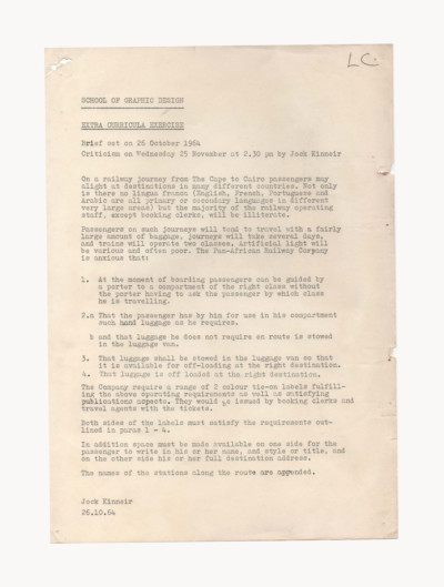
That year, Jock had been invited to run a graphic design workshop open to all Danish art academies and design schools. The workshop was titled ‘Information in the Environment’, with around 25 students, it ran from 5 – 9 March in the Design Department of The School of Architecture, Aarhus, Denmark. Peter Gyllan joined as an industrial design student of Copenhagen Academy of Architecture.
“The brief was about designing signs for a given locality in the city of Aarhus. Jock stressed the importance of locality. This people-centred approach was ahead of the time – professing that ‘when designing signs: try and get local flavour into it’. And I don’t know if at that time, how well we followed that brief.”“I think he expected us to be more knowledgeable about styles and typography and colour and perception – which we weren’t. It was, for me, the beginning. I only knew of Univers and Helvetica.”
“In the workshop I imagine part of his approach to teaching would have been to give us a ‘step-by-step’ rational way to work. But I remember Jock loved mentioning a story from when the Road Research Laboratory were testing the signage they designed for the motorways and roads. When it came to choosing the right green, an important person on the committee said his idea for the right green would be to use the same colour as his smoking jacket. So I can imagine they had to send for this guy’s wardrobe! It gave him great pleasure in recalling this moment – in all the rationality of their work – the green chosen was there because of a committee member’s smoking jacket.”

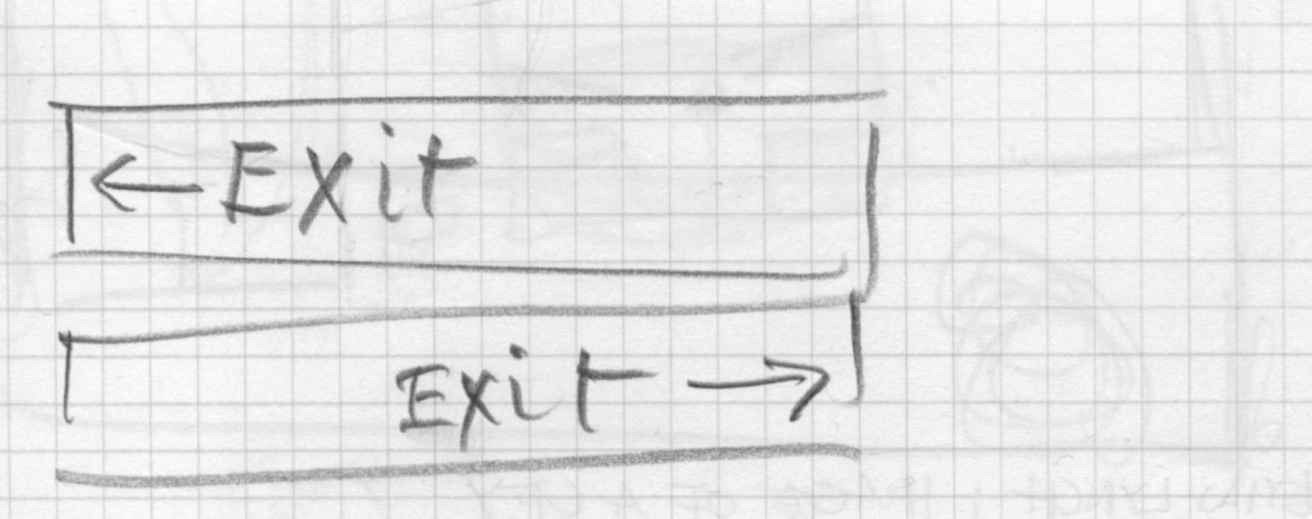
The workshop began with a slideshow from Jock going through some of the office’s projects; particularly the road signs. “We were divided into groups, one example of his key design principles – as per his illustration, was that text should follow the arrow, so if pointing to right, the arrow moves to the right, and the text moves to the right. This was different from common practice at the time – keeping a straight left margin.”
“The workshop engaged us with a people-centered approach – to think about local flavour, not form or a particular typeface. But again, I think he expected us to be more experienced. Most of us ended with using a san-serif like Helvetica or similar, rather than his own. Partly as it would have been odd, but also we were using Letraset and it wouldn’t have existed it in that format.”
“What made him less orthodox than other designers of that stature was because he was a teacher. Being surrounded by young people – with the job of showing them ways of working and the knowledge one has gained – this influences one’s personality.”

This was in 1973, so in ‘77 Peter presented his final-degree with a project about the signage of Copenhagen Airport. “Copenhagen Airport was primitive, all sorts of different signs everywhere, it was a mess. I collected material from around the world on how well-done airports did their signage.” A couple of years after getting his diploma Peter became an in-house designer at Modulex (of LEGO) – a visual communication company specializing in signage products and planning of signage on airports, in hospitals, schools and other public institutions. In the beginning of the 1980s he had a job coordinating a project developing an Arab language signage system. On his desk at Modulex he spotted two rare pieces; a feasibility study by Kinneir Calvert Tuhill Ltd titled ‘Modulex Arabic’ and the transcript of a presentation Jock had given at a Nato conference in 1978. In 2015 he wrote an article for novum magazine presenting Henrik Kubel’s and Margaret Calvert’s digitisation of the Transport Alphabet.

The Jock Kinneir Library would like to thank Peter for his time, support and for combing through his archive.

