Transportation Graphics: Where Am I Going? How Do I Get There?
23 October 1967
The Museum of Modern Art, 11 West 53 Street, New York City.
This presentation draws together some very interesting perspectives on the roles and politics of different stakeholders in the process of design, it also gives a fantastic overview of some of the design decisions made in Kinneir Calvert Associates signage. In correspondence after the symposium from Mildred Constantine, MoMA Associate Curator of Design, he was commended for “warming the hearts of the audience without a doubt”.
Referring to removing of arrow heads Jock says “Seeing these appendages go was like taking a stone out of one’s shoe”. He tells the audience “Ideally, a graphic designer should be regarded as a person skilled in communicating the sense of a situation through a variety of means probably using the sign as a last resource.” and points to the integral role of the ‘physical’ at that time for the scheme and the message to work; “A way of thought has been suggested by the hardware and a standard approach, akin to a grammar of layout, laid down.”
Credit: Sound Recordings, 67.9. The Museum of Modern Art Archives, New York

Jock Kinneir
Jock Kinneir, senior partner in Kinneir, Calvert and Associates, and head of the Department of Visual Communication at the Royal College of Art, London. He is Design Consultant for the British Airports Authority and British Railways and Responsible for the new motorway and road signs now being introduced in Britain.
I come before you as an Englishman, if not as an European, and I want to make clear that I speak from the background of a little country. My own experience which is bound to be different must be inapplicable to a certain extent; however, this will become evident.
I did wonder, as l was crossing the Atlantic, whether my journey was necessary. This sort of post-hoc soul searching is typical of the life under pressure these days and to avoid a discussion is, of course, a fatuous excuse. Nevertheless, when a lift of the administrative finger can cost millions, it behooves us to question our premises before, rather than after the fact.
This symposium is called graphics in transportation. The premise has already been questioned—transportation, yes, until we get some sort of automatic levitation. But has simple, ordinary graphics a place in this? Are we sure that we are not taking a quill pen view of the possibilities? Graphics are marks to be read and they work through the eyes only. If one’s eyes are already full with the road and dashboard instruments, then, static, exhortatory graphics have got to be very competitive in order to register.
What then do we do with graphics? Do we give them some sort of appeal? It is evident that there are some messages that need a more compelling medium than the graphic one and the area of transportation may be just that area.
Certainly, it is possible to have an appeal through the ear or through moving, dynamic graphics, but, fortunately, the necessity for compelling attention lies only in certain areas of communication. Much is only informatory and permissive rather than warning or imperative and I can see no better way than through the use of graphics to provide people with information—assuming that the cost of an automated electronic dial route system to and from anywhere, as if it were a telephone message, comes within the feasibility of the national treasury. Airing such a suggestion is enough to make any responsible public servant ready for the back of an envelope on which he would conclude quickly that graphics are a very good value in terms of directional signing. To say all this is to beg the question that I put at the beginning. My journey will have been worthwhile if it can help make traffic graphics better. This sounds as if I think that I can wave a wand and all will be improved.

This sounds like an opinion that designers sometimes have of themselves as being slightly less than godlike with a preemption of all the best ideas. It is the natural inclination of the specialist to think that he is the most important person in any situation which includes him, especially in a situation calling for subjective judgement. Rarely is it recognized that the most important person in any design situation is the client.
In the transportation situation, the most important person is the politician beyond the administrator. The politician has the power to vote money and access over interested parties; he is at the center of the activity and has the opportunity to think and act big. By definition he should think for the mass because he can initiate and decide.
Now it may seem that l have taken a power view of designers, painters and advertising men by hogging the word, creative. On the contrary, l believe that many men of affairs are extremely creative in their thoughts and acts, although they never touch a brush or pencil. They can be creative when the situation demands it by taking the opportunities and arranging for solutions.
The value of this symposium, therefore, can be twofold. First, it can help put designers in their place, that is, in the hands of the politicians. Second, it can reveal the design processes to the designers and politicians at the same time. This combined effort can bring about not only increased expertise on the part of the designer, but also a realization on the politician’s part that a design directive from him based primarily on political calculations is rather like deciding that a motorist should drive down the middle of the road in order to avoid giving offense to the politician on the right and the left.
The politician is recognized as being concerned with the possible and the designer is sometimes accused of being ahead of his time; therefore, the understanding politician who can carry the mass with him in giving effect to what seems to be mere prophecy can, in fact, bring about an economic boon by eliminating the intervening stages of compromise.
We can leave this Transportation Graphics Symposium more cognizant of certain factors to consider, but can we, also, take advantage of the design expertise? Yes, if we seek design guidance at the earliest possible stage before lay committees have hardened their view into straitjackets. A designer should be brought in to write his own brief and not to be confronted with it. I speak with some feeling on this matter because tomorrow I go to a symposium in Montreal on airport signs and symbols. I have been perusing the paper work that has been produced over the months largely by laymen who are apparently accustomed to using words. I must say that some of their opinions are really quite childish. Views are already congealing into a brief for some engineering draughtsman to execute. One of the unfortunate facts of graphic design is that it is relatively flexible and cheap to execute; therefore, it tends to be thought of as a crutch which can be used to support a poorly constructed situation. Ideally, a graphic designer should be regarded as a person skilled in communicating the sense of a situation through a variety of means probably using the sign as a last resource.
There is nothing inappropriate in an architect calling on a communication designer to advise him on the behavior and guidance of people. The result of a conference may suggest a constructional, rather than a graphic solution, to the problem. As an example, I would quote you a personal experience at the Glasgow Airport where we did the signing. Incoming passengers walk English fashion across the tarmac to one of the building’s fingers where they enter a door. As they go up the stairs to the first floor, they can see the tunnel building perfectly well through the glass wall; however, as the passenger reaches the first floor, he starts walking towards the airfield. The reason is that when one comes upstairs from the ground floor, the staircase makes a one hundred and eighty degree turn so that the passenger is facing in the wrong direction. The result of the architectural design (so-called) necessitated the construction of a graphic crutch in the form of a sign. If the communications expert had been consulted at the conceptual stage or if the architect’s training had contained a small stint of movement psychology, then the top of the staircase would have been facing towards the terminal.
The plea should go out from this symposium to the general herd for better designed graphics which make less demand on the environment. This approach will be not only more human but also the communication will be more effective, thereby giving better value to the payer and user, the architect and designer.
All this suggests the need for a codification of the patterns of mass behavior which presently are within the experience of such people as exhibition designers, some architects, the police, and road researchers. The idea of codification suggests another reason why the politician is a key figure. Communication depends on consistency in expression. Even if an unfamiliar word or pictogram is introduced, through education and use, it can become understood. A familiarization with signs through widespread and consistent use is the basis for understanding. It is obvious, therefore, that the more a system is used, the more effective it will become. This demands consistency in choice of word, color, letter form, and layout. In other words, consistency in design is the visual equivalent of grammar in language. The politician can play a big part in establishing consistency by thinking big so that the design process is handled not piecemeal but (to use a military expression) wholemeal.
In Europe, as you know, there is a convention on symbolic road signs. The convention is that some countries adhere to it and some countries do not. If you have ever driven a car in Finland or Yugoslavia without knowing one of four languages, you know how confusing it can be. This is an area where there is partisanship, stupidity masquerading as logic, considerable inertia, and no small amount of political misdirection.
When l began to be concerned with the British design program, I was urged to abide by the continental convention: however, when it was possible to demonstrate that some signs, such as the one indicating, “stop,” could be vastly improved, the committee concurred. In this particular situation, the feeling was that it was more effective to use the negating diagonal line rather than simply placing a circle around the stoppage as they do on the continent. The designer can push in a certain way, wrangle and lose his temper (as I did) but beyond-a certain point he can do no more. You will understand, therefore, the importance that I attach to the role of the client-politician.
In the field of directional signing, the situation is more flexible. I think that we did a good job of the highway graphics even though the terms of reference excluded the physical design and no attempt was made for a coordination between all the various objects which we lumped together under the term, “street furniture.” This is an example of a political directive which thought simply in terms of moving people from A to B. The approach was uncultured but perhaps even time would not have helped; big thinking was the nature of the job— but we were hurried by the timing of the road building program.
You may feel that l have pictured a small amount of the bureaucracy which is unsympathetic to design. I would say that it showed considerable political skill by the fact that any program developed out of the situation at all. The fault lies in the functioning of democracy. The situation illustrates trying to please too many neighbors in the face of demonstrable fact and we are, again, in the realm of politics. How does one have a well-functioning technocracy which takes into account human quirks; a really efficient, really democratic society?
We are faced with efficiency versus democracy and this is a matter for the politician. The current re-appraisal in Britain of public directional systems is the result of a combination of pressures coming together in a peculiar environment. It is no news that in every country the population is exploding and the transportation revolution is in full swing. In England the situation is aggravated because of the confined space which no amount of technology, short of ocean drainage, can alleviate. Further constraints are a native inclination to conserve a rich physical legacy, a high population density, and intensive land utilization. In simple terms, there are a lot of very beautiful little towns and villages strung out along a dense network of small roads.
G. K. Chesterton described these paths as “the drunken English road.” They still follow the paths which, yesterday, tactfully snailed around small holdings but which now have to carry a tide of impatient tourists and local drivers.
The last hundred years of railway construction has helped to bring about a change in the attitude towards private property and has made it possible to drive roads straight and wide. Even in the 1930’s, cars had room in which to stretch their legs; however, the directions in the 1933 sign system are totally inadequate for today’s speeds and volumes.
The crescendo came at a moment when the design profession was growing out of its advertising cradle and a few people were using designers for purposes other than decoration and selling. The Government was sympathetic to the suggestion that the designer’s help should be sought regarding the designing of road signs. The designer’s position was, after all, honorary and they had nothing to lose but their chairs. So, a designer was appointed to advise in the design of signs for Britain’s new motorways.
The situation looked promising. The designer was to be advised by scientists from the Road Research Laboratory—objective people with wide experience in evaluation techniques. The results were to be screened by a panel to include representatives of road-using organizations, landscape architects, local government officers, the police, and others.
The program which lasted over eighteen months proceeded like a game of pragmatic leap-frog with theory and emotion being translated into test pieces at each stage.
Initially, the pieces were small in scale and subject to group tests with the designers often taking the alternative suggestions out and viewing them in the London street environment before presenting a solution to the committee. Full size designs would, then, be subject to testing by the Road Research Laboratory in conditions as near actual life situations as possible.
The results of these tests, the parallel evaluation of particular aspects of the problem along with the thinking of the experimental officers, led to the distillation of a body of knowledge which served as a parameter within which the designers knew they could operate with greatest efficiency. Ultimately, signs were erected on stretches of the motorway and were viewed by the whole committee. The final results were then codified by the designers and the program rolled gently into action.
Two years later a committee was formed to undertake a study of signs on the all-purpose roads and to evaluate the motorway signs. This second commission’s duty was far more extensive and complex. Not only were they to be concerned with the hierarchy of signs but also they were confronted with the dense network of roads, main highways, secondary and local roads that had to be distinguished along with explaining the multiple junctions and huge roundabouts. The diminishing gap between Britain and the rest of Europe required the committee to examine, sympathetically, the continental practice of using symbols for warning and mandatory signs. At the same time, the architects who were concerned with military installations, both at home and overseas, asked for an appraisal of military requirements in unit identification and site signing. The programs dove-tailed conveniently. it was possible to add another category to the hierarchy and to express all of them in different tones of voice. An examination of typography seemed to be in order.
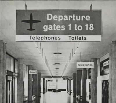
Objectively, the advantage which the lower-case letter form has is legibility and, subjectively, the capital letter form has authoritarian associations. These characteristics were used in deciding that lower-case forms would be used for civilian information and direction signs and capital letters would be used for military designation and civilian command signs (such as “POLICE-STOP”). By using lower-case letters, frequently, capital letters gained in value by their rarity: lower-case forms, in effect, constituted the conversational tone, while capitals supplied the, occasional, shout. This basic decision resulted in a choice of lower-case letters for signs in hospitals, airports and railway stations—all situations of stress where a conversational rather than a dictatorial tone is appropriate.
It has been said that a civilization gets the public lettering that it deserves, although surely the Roman Empire deserved nothing as fine as the Trajan inscriptions. To be confronted with such a commission is for the designer to meet his “moment of truth” for it is a challenge to his skill, his integrity and his staying power. It is the moment when every assumption must be questioned and when ignorance is a blessed state of freedom from professional traditions. Had we ever had any experience in sign design? Only at Gatwick Airport which was just enough to have introduced us to the syntax of the language.
In the first motorway exercise, we were directed to use lower-case letters on the signs. While this was evidently a subjective appraisal by the committee, there were parties on the touch line who disagreed vehemently so that the Road Research Laboratory had to act as umpire. They defined the requirements, assessed the results and, in so doing, stimulated a progressive refinement in application. They also produced a body of knowledge expressed in figures which are the only facts acknowledged by scientists. It may be added that these men were, however, interested in the aesthetic factors.
The Laboratory group proposed a definition of legibility which could not be bettered for the purpose—cost effectiveness. Since we were using public funds, the subject would have eventually presented itself and it is doubtful if any design program ever suffered from this criterion.
The criterion forced us to design a legend on a signboard of a certain size (and hence cost) that could be read as far away as possible. We needed to know how far away the sign had to be read so that we could make it neither too large (and costly) nor too small (and useless).
The test conducted by the Laboratory on the samples submitted to them showed that serifed capitals could be read some three per cent farther away than the samples in lower-case letters. This fact alerted us to the need for a more economical use of space around the word. In addition to the five per cent superiority in readability, there was a fifteen per cent saving on the width of a sign (depending on the letter mix) by using the lower-case letter form. A despairing engineer had once complained to me that he had only six feet of roadside verge in which to site a sign seventeen by nineteen feet and this type of situation added further justification for our choice.
Two alphabets of exactly the right weight for use with reflective material were designed. We found it necessary to open the letter form and spacing in order to improve distant reading and counteract the effect of halation. It was also necessary for us to establish the rules to serve as a guide for contractors for assembling letters into words in order to achieve a maximum advantage of the space, for assembling words into phrases, and for stacking words and relating them to road symbols.
Since cost-effectiveness was our criterion, it was evident that we would have to work in terms of minimum preferred dimensions between units. Once again, it was the scientists who put the necessary tool in our hands. They suggested that we use, as a unit of measurement, the width of a letter stroke, e.g., the capital “i”. In this way the dimensions would remain proportionally the same even if the size of the letter changed. The implication of this thinking was that any graphic element which did not prove itself necessary should be eliminated. We, therefore, disposed of arrow heads on road symbols and ruled boxes around groups of names. Seeing these appendages go was like taking a stone out of one’s shoe as well as giving us greater flexibility in layout and a greater truth to geography.
The latter was the fundamental factor. It dictated that, wherever possible, map-type signs depicting the actual layout of road junctions would be preferred to signs using stacks of names and arrows.
The stack-type signs would be used only when there was not enough space in which to erect the larger map signs.
The designs that were finally adopted are so strong that a driver can grasp the layout of a junction some distance before he needs to read the names. The graphic road symbol is the target which alerts the driver to the presence of the sign when previously it had been the sign plate which he noticed first. The driver was invited to notice the background to the information rather than the information itself. This new, two-stage approach spreads the assimilation of information over a longer period of driving and makes legends easier to grasp.
Throughout the project, design and economics were conveniently working together. We found it considerably cheaper to reflectorize white words and symbols on a dark ground rather than on the reverse. When, however, local destinations or minor roads are involved, the signs are inevitably smaller; therefore, it is necessary to have a white sign in order to insure conspicuity. This physical requirement was utilized to express the grading of the roads and was, in part, responsible in determining the need for two alphabets of different weights. The other reason being the halation effect of the reflective material. White letters have to be lighter in weight than black ones for similar performance.
The scientists then advised us that white letters on a color in the blue—green range were most legible and a wrangle over the exact choice of color ensued which was lengthy and at times impassioned. Black, everyone agreed, was too funereal; very dark blue was found often to look black. Since the scientists had advised that blue should be reserved for motorways, the hue had to be green. The argument, then, polarised between our demand for a bright green which every man could recognize and name as such and the architects’ demand for a green which was nearly black (‘the blacker, the better’). Our opinion was that their choice conformed to an ‘in-taste‘ and was unrealistic. While this argument raged, the Laboratory made some signs for testing in a mid—green of their own choosing. These signs were erected at Slough near London and the color finally used came to be known as Slough green. Initially, we opposed the selection on subjective grounds; however, we feel now that it has some merit.
In the military program, the signs were generally smaller than those required on the motorways. For this project we were required to produce a system which would identify areas occupied by the regiments and their attached sub-units. We were also to identify the buildings’ use and to give directions on how to locate them. Those designers who have ever come up against military tradition will recognize that in our having to be concerned with unit title signs, we were treading on holy ground- Colors appropriate to the arm, the unit crest (or crests) and the full title had to be displayed on each sign. The permutations were enough to make a computer sweat, for there were short and long titles, (ranging from a few cryptic letters to three lines or words spelled out in full), single and psychedelic combinations of color; circular, triangular. oblong and undefinable shapes of badges. The only waiver we were given was that the unit battle honors, which in some cases stretch back to the seventeenth century, did not have to be displayed.
This material had to be assembled in a form suitable for display wherever the army went. It had to be as mobile, rot proof, termite proof, sun proof and frost proof as the army itself. Backgrounds for these potentially bird-of-paradise objects would vary from green pastures and jungle patches to sun desert, red or yellow brick walls, concrete, color wash, bamboo tatty work and corrugated iron.
As so often happens, the demands suggested the solution. We decoded that all the graphic elements should be separated from the background with white which would conveniently assist in making the sign conspicuous. Black lettering would be used on the white background with the two neutrals acting as a foil for the colors. We further decided that extruded aluminium planks would provide the most practical vehicle for the graphics. The graphics were to be applied in the same form as the non-reflective sheet material which is used on road signs. These signs would not need repainting and even if they were damaged, they could be repaired easily. They were light to transport, quick to assemble, and had a hard, soldierly quality. As previously noted, we had decided that capital letters were to be used for military signs; however, we recommended that multiworded texts and some few other signs of a conversational nature should be in lower-case letters. This combination of traditional colors and crests set off by black capitals and crisp white borders has provided a vernacular that marks the military presence with authority.
The use of extruded planks in place of the usual reliance on sheets of various material fixed to angles and battens introduced a further complication to the graphic problem. Developed in America for road signs, it was possible to grasp the moment of their introduction into Britain. We therefore asked the manufacturers to produce a range of sizes which were related to letter sizes, which in permutation, would give flexibility to the layout of the graphics. A range of sizes was requested which would accommodate different title lengths and different badge sizes. A table was worked out in which the number of letters and lines could be translated readily into the required combination of plank widths. The hardware by this time had become an integral element in the total design of the sign. Analysis of badges then made it possible to lay down parameters for positioning them. The kit of instructions has been well used by the authorities and lends a homogeneity to even areas with widely different architecture. Signing is an activity in which discipline is a virtue and the military attitude is a welcome contrast to much civilian activity. The organizational discipline imposed by the use of the planks has now been extended to become the basis of a discipline of expression. The itemized nature of the construction kit has been paralleled by an itemising of the information to be shown. A way of thought has been suggested by the hardware and A standard approach, akin to a grammar of layout, laid down. This work, which grew naturally out of the military program. has been developed and codified for the British Railway Board, and its concept adopted and extended for the British Airports Authority. The continuity of signing at rail stations and airports makes this inevitable good sense. The basis of the project was itemisation with a rigorous and logical ordering of the information to be conveyed. We see simple rather than port-manteau statements along with the practical fact of being able to remove a piece of information without disturbing the associated signs. In the military work, we found it useful to use red for the directional elements (arrows or chevrons) both for military connotation and as a further means of itemising or separating information— black word equals destination. red arrow equals direction. In the railway work, blue Was substitued for red in order to achieve the same effect, partly because it seemed more civilian and partly because it complimented the British Railways livery color for rolling stock. On station directions, sometimes phrases such as ”over the bridge” are used and these are also, lettered in blue. On the road signing program, the old established method of spacing letters by placing each on a tile. rather as a type face is placed on its metal body. was extended to cope with inter-word and Inter-linear spacing. This method was adopted for station and airline signing; but, a new letter form was drawn because in this situation it did not have to overcome the halation effect caused by reflective materials. The letter form could be suited more to its architectural context, although a fine consideration of weight was the predominant motive. On road signing it was necessary to draw two alphabets, one light and one heavy for use on dark and light backgrounds respectively, the aim being to achieve an equal visual level. This was, also, necessary in the railway alphabet but it was possible to reduce these letters to what, in effect. became a keyline drawing: i.e., an outline letter or filled round for the white letter, the thickness of the outline providing the difference in weight. This outline letter provided a third variation which has proved of occasional use in printed matter.
The condition of complexity mentioned at the beginning of this talk is particularly evident in busy terminals and the plank system with its emphasis on itemisation meets the demand perfectly. It is a tidy situation with words fitting nicely onto planks, but what about symbols? Generally, words are oblongs and symbols are squares. The use of symbols is a vexed and misunderstood one with a good amount of presumption and emotional attachments to attitudes. Only a few things are clear about symbols and one of them is that symbols often are not clear. Instead of being vehicles for international understanding, they tend to be counters in esoteric design rites where private aesthetic convictions and intellectual demands for consistency rule out common-sense and humor. The official insistence in the road signing program of adhering to the continental practice of attaching the meaning of prohibition to circular plates, when it was demonstrated that crossing an image out with a diagonal line was so meaningful as not to need learning, is an example of this kind of attitude.
One advantage symbols do have over words is that they can be bolder and can carry their message farther. For this reason they have been used in the airport signing as location beacons which can be recognized at a distance but not used to the elimination of other directional information. Words have been used with symbols wherever it has been possible to design a symbol which is meaningful, and symbols have been incorporated in the plank system.
Is there a perfect signing system for such international situations as airports? Probably not for there will always remain a pathetic residue of nervous travelers who having read a sign like to ask what it says. There are also those more experienced who just do not believe them.
Thank you to Christina Eliopoulos at The Museum of Modern Art, New York for assisting to arrange permission to publish this audio.
Dot Zero magazine
Dot Zero was the workings of Unimark studio, supported by Finch Paper, with 5 issues published between 1966 and 1968. An interview between Michael Beirut and Massimo Vignelli can be read on Design Observer. Unimark was co-founded by Ralph Eckerstrom, Jim Fogelman, Wally Gutches, Larry Klein, Bob Moldavsky, Bob Noorda and Massimo Vignelli. The Dot Zero editorial board featured Herbert Bayer, Ralph Eckerstrom, Bob Malone, Jay Doblin and Mildred Constantine.