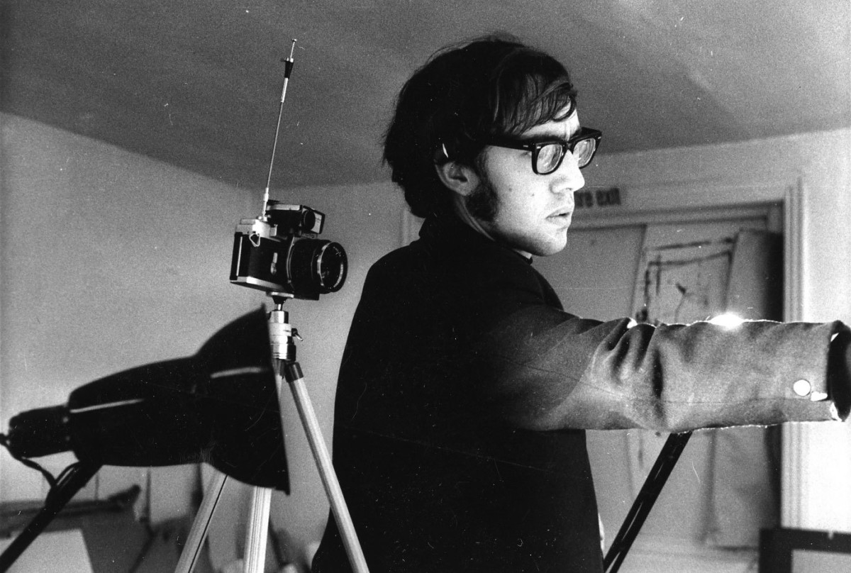
“…he had a quite up-to-date modernness”
c.1967
In discussion with junior designer Andrew Haig, we learn more about Jock’s thinking, day-to-day studio life and working in the team.
Fifty years ago, in 1967, the UK and Ireland first entered negotiations towards European Economic Community membership with support from the Italian and Dutch governments, The Beatles released one of the most acclaimed rock albums ‘Sgt. Pepper’s Lonely Hearts Club Band’ and the second British nuclear submarine HMS Renown was launched. It was in this context that Andrew, a “nerdy, callow” art department graduate from Reading University, was offered a job at Kinneir Calvert Associates. As a junior, and in such a new industry for the time, he was closely tutored by Jock and Margaret.


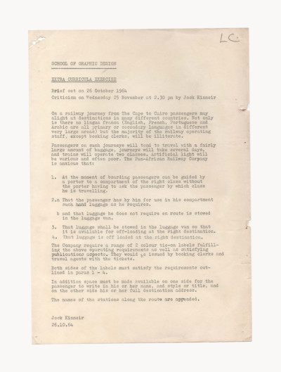
Earlier, starting his studies in 1963, Andrew was aware of the discussion about appropriate letter forms for signing. This first came into both public and design debate in 1958 during Kinneir and Calvert’s work for motorway signing. In 1967 Andrew wrote his undergraduate thesis about “the unfolding of a corporate identity programme for British Rail house style and the emergence of upper and lower case as a public letter form.” Among the people he interviewed was Jock “who generously gave time”, they spoke about signage operations at Jock’s Royal College of Art office, behind the Victoria & Albert Museum, off Exhibition Road, where Jock greeted him “with attention and complete respect, listening patiently to my questions and answering in a very courteous fashion; he was disciplined with his language”. While it wouldn’t have just been his thesis that got Andrew the job, it was very interesting for Jock and the British Rail Management because “it highlighted that station managers were still painting their own take on the scheme”. Following this and studio time that followed, Andrew came to understand and appreciate Jock as a modernist.
The world is now full of upper and lower case signs – all very rational – and he was the force behind that. Look at the visual landscape, the whole visual landscape of the country changed in this period.”
Andrew, working under the design direction of David Jones initially and then Margaret, felt no sense of hierarchy in the studio culture, “on my first day at work Jock walked in with something he had just designed and asked me what I thought of it. This felt very rare, Jock was very modest about his work.” Socially they would all have lunch together “every day you would hear Jock’s chair scrape on the floor, then he would come in and say ‘mangiare!’, Italian for ‘let’s eat!’. He was very friendly.” So – they would gather their luncheon vouchers and head to the nearest bistro.
Through studying engraving, surveying in the army, designing exhibitions whilst at the Central Office of Information, and the two houses he went on to design – we understand Jock had an interest in the precise practice of an architect. This he manifested through his “architectural eye when it came to street furniture” and the relationship it had with signage. “As someone working in the studio you would see skills and innate abilities they both had. Margaret, originally coming from illustration – her ideas were phenomenal, was a systems person and her work had a technical backdrop”, and Jock whose design language was “modernistic, painterly and visually strong”. They were once all set to work on a range of luxury packaging for gourmet tinned food at Harrods. “Jock had a totally abstract response – Bridget Riley-esque with his use of coloured stripes and beautiful colours, they used it across the entire range.”


“I expect his and Margaret’s teaching would have had a heavy emphasis on rationality and intellectuality. There should be a reason for something to be on the paper – neither of them being taken with work that was pure declaration. Yet this nature of work shows he also had an eye for playful, experimental challenges.”
Similarly while Andrew worked on an annual report for Mills & Allen (an outdoor advertising company) he was going through the pages of client accounts “annotating plus, minus and equal signs as a note to myself – hand traced before the typesetters got to work. Jock saw them and said ‘that’s innovative, leave them in’ – that was an example of his belief and willingness to support something that hadn’t been done before. So we went ahead!” A trade magazine for accountants was taken by the design, and reproduced it fully page after page in their publication. “This wasn’t me being novel, but Jock seeing the potential”. Jock and Margaret leaving to teach each day at noon and returning at four felt part of office routine. It held such importance in the studio that Jock gave Andrew “one day off a week to start teaching, whilst also increasing my salary at the same time.”
In 1971, after four years at the studio, Andrew moved on to work freelance, Jock handed him a signage job to help him get set up with, “it involved designing and implementing signage systems for two housing estates in the London Borough of Kensington and Chelsea, it was a year’s work – immensely generous and invaluable”.
The Jock Kinneir Library would like to thank Andrew for his time in conversation and exploring through his archive.


